Creating a Drop Down Component
Create a component using schematics and name it with your initial E.g:
jd-drop-down
We are going to make it render the Material UI's select component at https://material-ui.com/components/selects/, which displays select input, similar to the existing sc-drop-down.
To do this:
-
Install the @material-ui/core module with:
yarn add @material-ui/core -
Import the Select and MenuItem and other necessary components in src/components/JdDropDown.tsx with:
import InputLabel from '@material-ui/core/InputLabel'; import MenuItem from '@material-ui/core/MenuItem'; import FormHelperText from '@material-ui/core/FormHelperText'; import FormControl from '@material-ui/core/FormControl'; import Select from '@material-ui/core/Select'; import { makeStyles } from '@material-ui/core/styles'; -
Add dropDownList to your component definition in the template:
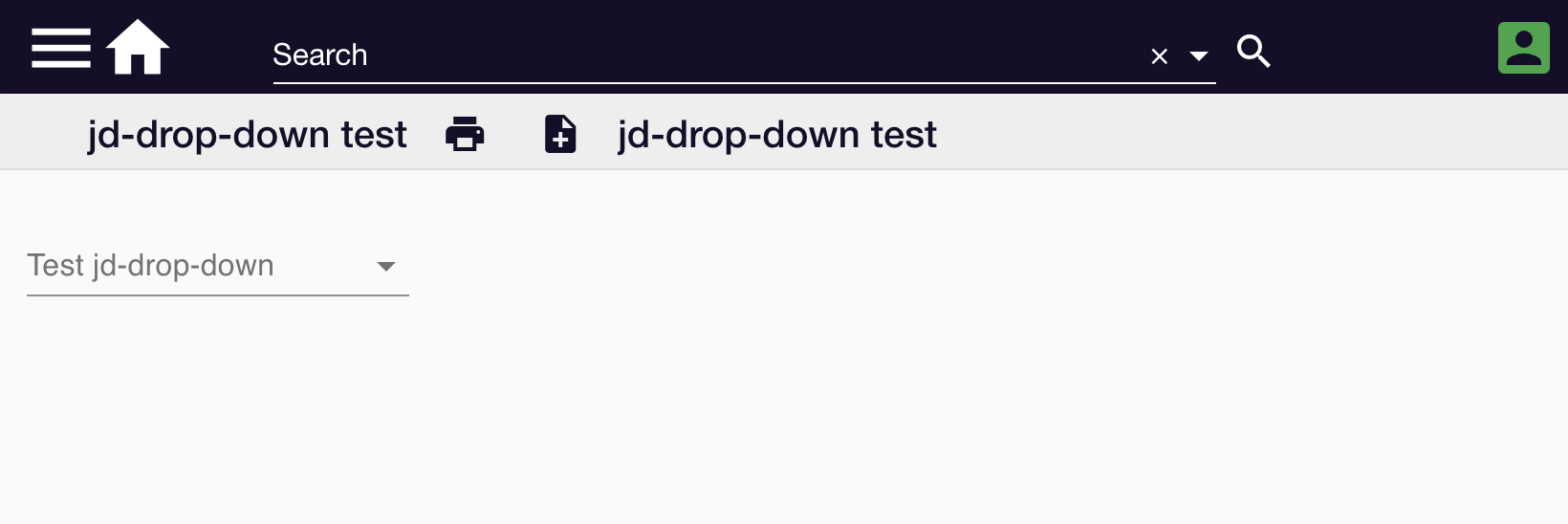
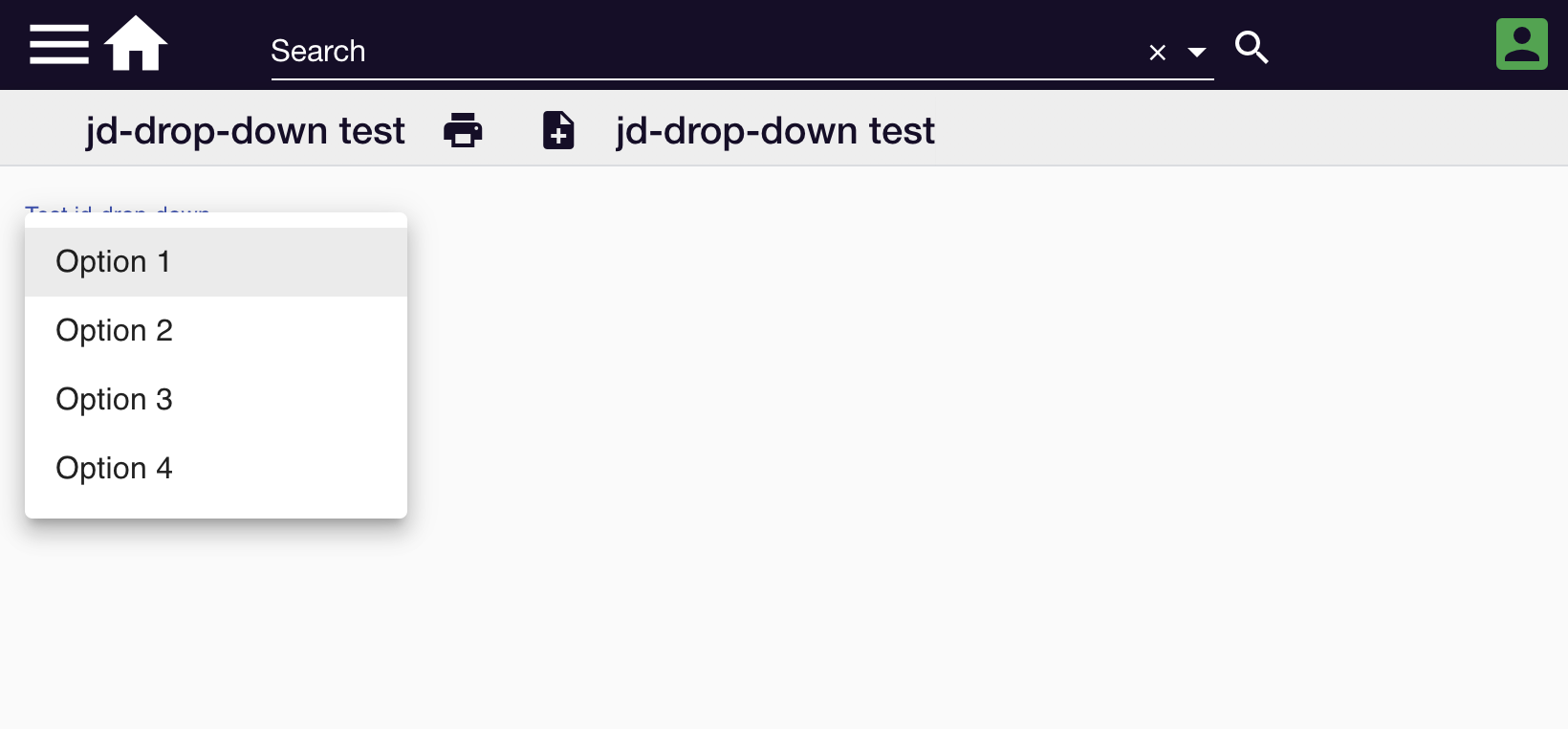
{ "label": "Test jd-drop-down", "componentName": "jd-drop-down", "name": "testJdDropDown", "fullWidth": true, "dropDownList": [ "Option 1", "Option 2", "Option 3", "Option 4" ] } -
Add the material-ui css-in-js style:
javascript
      const useStyles = makeStyles((theme) => ({
        formControl: {
          margin: theme.spacing(1),
          minWidth: 120,
        },
        selectEmpty: {
          marginTop: theme.spacing(2),
        },
      }));
and add classes variable to be used in the jsx:javascript const classes = useStyles();to know more about styling please look at https://material-ui.com/styles/basics/ -
Add the onChange handler:
```javascript function onChange(event) { setValue(event.target.value);
changedDocumentService.valueChanged({ document, fieldName, fieldValue, formParameters, template, componentDefinition, key }, event.target.value); }
6. Replace the JSX:html``` To:jd-drop-down works. Please edit src/components/JdDropDown.tsx to make changes
Next Steps
-
.
.
.
.
html
   <FormControl className={classes.formControl}>
        <InputLabel id="demo-simple-select-label">{componentDefinition.label}</InputLabel>
        <Select
          labelId="demo-simple-select-label"
          id={componentDefinition.name}
          value={value}
          className={classes.selectEmpty}
          onChange={onChange}>
          {
            componentDefinition?.dropDownList?.map(item => <MenuItem value={item}>{item}</MenuItem>)
          }
        </Select>
      </FormControl>
You should see the component build in the npm watch window:

webpack 5.14.0 compiled <span style="color:green">successfully</span> in 208 ms
-
Reload the component test template. A drop down will display:
This example is available at https://github.com/formbird-components/component-examples/tree/master/jd-drop-down