Creating a Text Box Component
Create a component using schematics and name it with your initial E.g:
jd-text-box
We are going to make it render the Material UI's text field at https://material-ui.com/components/text-fields/, which displays text input, similar to the existing sc-text-box.
To do this:
-
Install the @material-ui/core module with:
yarn add @material-ui/core -
Import the Text Field component in src/components/JdTextBox.tsx with:
import TextField from '@material-ui/core/TextField'; -
Add the onChange handler:
```javascript function onChange(event) { setValue(event.target.value);
changedDocumentService.valueChanged({ document, fieldName, fieldValue, formParameters, template, componentDefinition, key }, event.target.value); }
4. Replace the JSX:html``` To:jd-text-box works. Please edit src/components/JdTextBox.tsx to make changes
Next Steps
-
.
.
.
.
html
   <TextField
        onChange={onChange}
        required={componentDefinition.mandatory}
        id={componentDefinition.name}
        label={componentDefinition.label}
        value={value} />
You should see the component build in the npm watch window:

webpack 5.14.0 compiled <span style="color:green">successfully</span> in 208 ms
-
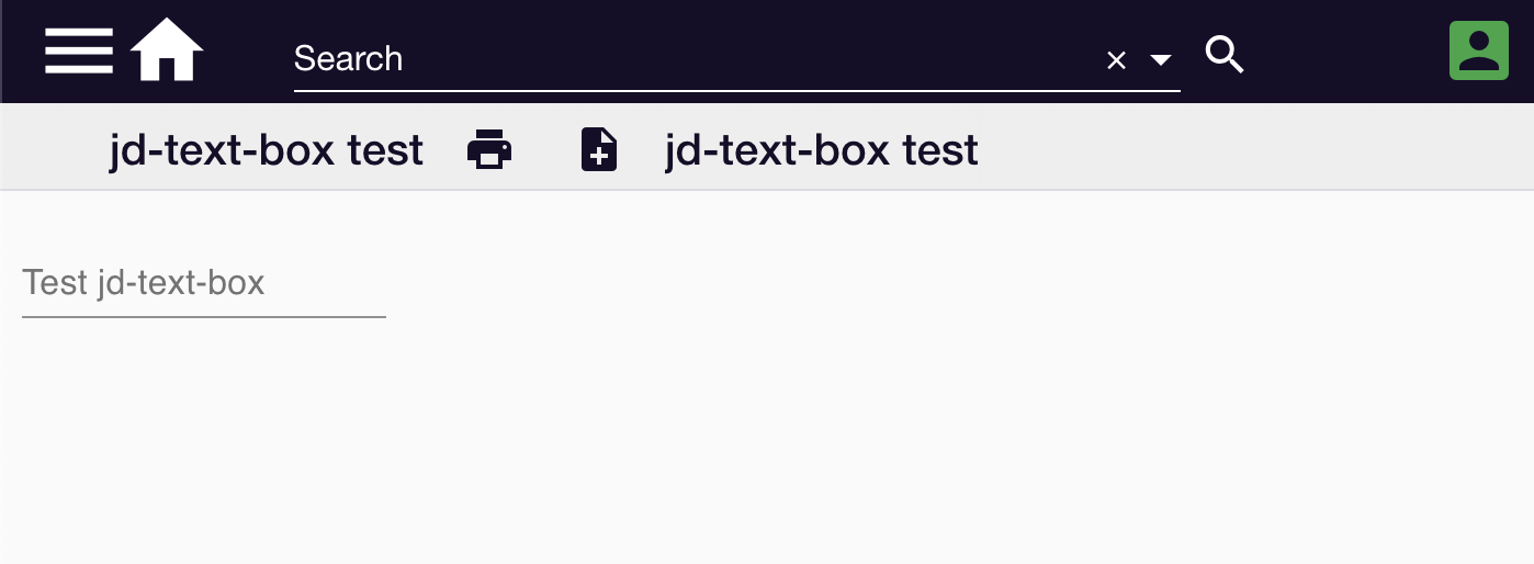
Reload the component test template. A text box will display:
This example is available at https://github.com/formbird-components/component-examples/tree/master/jd-text-box